| ________________
CM . . . . Volume XXI Number 13 . . . . November 28, 2014
excerpt:
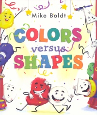
Colors and Shapes are both auditioning for the chance to star in their very own book. Each group thinks it has got the most to offer, and soon they begin competing to see which team is better. As Colors mix and Shapes combine, the competition grows fierce, but when the two groups find themselves unexpectedly brought together, the result is a perfect ending for a good book.
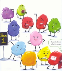
The framework of this story, where the two groups are each auditioning to get their own spot in a book, lends itself well to a style of storytelling in which the colourful and shapely illustrations take precedence over the written text. There is no narration in Colors Versus Shapes. Rather, all of the words included in this tale are spoken by the various characters and are presented in speech bubbles. Primarily, the written aspects of the book are used to help identify the different (and sometimes unusual) shapes and colours shown. The images, themselves, are what really move this story forward, taking up most of each page and giving the reader plenty to experience, sometimes without any accompanying text at all. However, since some of the words and concepts may be unfamiliar to readers, such as colours like turquoise and shapes like heptagons, the choice of text, coupled with the prominent illustrations, makes this book an ideal read-aloud. What makes the story, itself, unique is that it goes beyond the basic concepts for learning about colours and discovering shapes. There is, of course, a group of primary colours which start the audition off by trying to explain what makes Colors the best candidates for starring in a book. But soon the Colors begin to mix, showing readers a variety of different colour choices. There are basic mixes, like having blue and yellow create green, but there are also different options, like having yellow and green come together to make lime, and placing green, blue, and indigo together to have a group of cool shades. Likewise, the Shapes also get an interesting showcase. One of the first tricks the reader sees is how two triangles come together in an acrobatic stunt of jumping off trampolines until they stick together in the form of a square. Then there is also a whole host of less common Shapes that come out to play, including rhombus, nonagon, and irregular polygons. As with the colour choices, there is a wide array of different and uncommon shape types shown here which make this story stand out amongst other books with a similar theme. Colors Versus Shapes is not merely meant to be educational, however. This is a fun book that is full of action, with characters jumping, diving, and even being shot out of cannons. At the climax of the tale, Colors and Shapes come together to create a spectacular set of scenery for the stage they've been auditioning on, a feat displayed in a two-page spread completely without narration. This lively set allows readers to actively engage with the story by trying to find all of the different colours and shapes included in the scene. Mike Boldt's vibrant, cartoonish style of illustration, along with his entertaining storyline of two teams competing for the starring role of a book, makes Colors Versus Shapes an unique, educational, and all around enjoyable read. Highly Recommended. Meredith Cleversey is a librarian in Cambridge, ON. She loves to read, write, and live in a world of pure imagination. Copyright © the Manitoba Library Association. Reproduction for personal use is permitted only if this copyright notice is maintained. Any other reproduction is prohibited without permission.
Next Review |
Table of Contents for This Issue
- November 28, 2014. |
 Colors Versus Shapes, written and illustrated by Mike Boldt, is a fun, creative way to explore the world of shapes and colours. The story is set-up as a competition between two teams, with each group showcasing its talents by highlighting various shades and forms the Colors or Shapes are able to take on. The antics of each group get more exciting and frantic until one Color collides with a Shape, and both groups realize they can make an outstanding story if they all work together.