| ________________
CM . . . . Volume XVIII Number 30 . . . . April 6, 2012

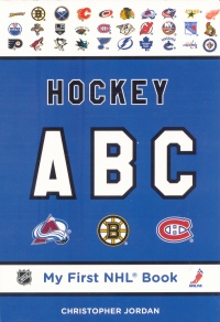 |
Hockey ABC. (My First NHL Book).
Christopher Jordan.
Toronto, ON: Fenn/Tundra, 2011.
28 pp., board, $8.99.
ISBN 978-1-77049-319-3.
Subject Headings:
English language-Alphabet-Juvenile literature.
Hockey-Juvenile literature.
National Hockey League-Juvenile literature.
Preschool / Ages 2-5.
Review by Dave Jenkinson.
*** /4
|
| |
|
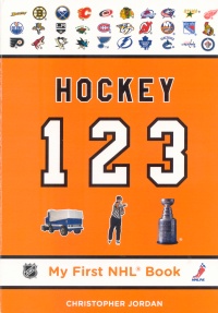 |
Hockey 123. (My First NHL Book).
Christopher Jordan.
Toronto, ON: Fenn/Tundra, 2011.
22 pp., board, $8.99.
ISBN 978-1-77049-320-9.
Subject Headings:
Counting-Juvenile literature.
Hockey-Juvenile literature.
National Hockey League-Juvenile literature.
Preschool / Ages 2-5.
Review by Dave Jenkinson.
*** /4
|
| |
|
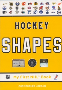 |
Hockey Shapes. (My First NHL Book).
Christopher Jordan.
Toronto, ON: Fenn/Tundra, 2011.
22 pp., board, $8.99.
ISBN 978-1-77049-321-6.
Subject Headings:
Shapes-Juvenile literature.
Hockey-Juvenile literature.
National Hockey League-Juvenile literature.
Preschool / Ages 2-5.
Review by Dave Jenkinson.
**½ /4 |
| |
|
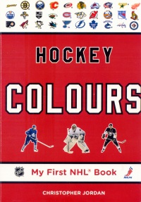 |
Hockey Colours. (My First NHL Book).
Christopher Jordan.
Toronto, ON: Fenn/Tundra, 2011.
22 pp., board, $8.99.
ISBN 978-1-77049-322-3.
Subject Headings:
Colors-Juvenile literature.
Hockey-Juvenile literature.
National Hockey League-Juvenile literature.
Preschool / Ages 2-5.
Review by Dave Jenkinson.
*** /4
|
| |
|
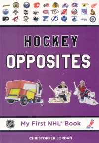 |
Hockey Opposites. (My First NHL Book).
Christopher Jordan.
Toronto, ON: Fenn/Tundra, 2011.
26 pp., board, $8.99.
ISBN 978-1-77049-318-6.
Subject Headings:
Antonyms-Juvenile literature.
English language-Synonyms and antonyms-Juvenile literature.
Hockey-Juvenile literature.
National Hockey League-Juvenile literature.
Preschool / Ages 2-5.
Review by Dave Jenkinson.
**½ /4 |
| |
|
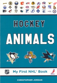 |
Hockey Animals. (My First NHL Book).
Christopher Jordan.
Toronto, ON: Fenn/Tundra, 2011.
22 pp., board, $8.99.
ISBN 978-1-77049-317-9.
Subject Headings:
Animals-Juvenile literature.
Hockey-Juvenile literature.
National Hockey League-Juvenile literature.
Preschool / Ages 2-5.
Review by Dave Jenkinson.
*** /4 |
| |
|
excerpts:
BIG / SMALL
A Zamboni is big. A hockey puck is small. (From Hockey Opposites.)
Florida Panthers
Established: 1993.
When selecting a name for their hockey club, Florida's team owners wanted to draw attention to a local endangered animal. They chose the panther, as it is the quickest striking of all cats.
PANTHER
The panther is the state animal of Florida, where only 80 to 100 of them still live in the wild. A male panther can weigh up to 160 pounds (73 kilograms). (From Hockey Animals.)
Four board books in the "My First NHL Book" series were published in 2010, and they were reviewed in CM (Vol. XVII, No. 26, March 11, 2011). This quartet has been reissued with some modest content changes while two new books, Hockey Opposites and Hockey Animals, have been added to the series.
Originally costing $9.99 per title, the price of each series title has now been reduced to $8.99. The author's name has been added to the cover of each book, and the NHL team logo "banner" that appears at the top of each cover has been changed to reflect that some teams, like the LA Kings and the Nashville Predators, have modified their logos while the Atlanta Thrashers team has ceased to exist and a new Winnipeg Jets team and logo have come into the NHL. Such logo changes also appear, where appropriate, throughout the four original books in the "My First NHL Book" series.
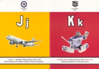 The biggest change in the four original titles is found in Hockey ABC where each letter is now shown in both its upper and lower case forms. In the 2010 book, E had been represented by an elbow pad, and, in my earlier review, I was critical of the fact that this piece of equipment was presented without any context. In the 2011 book, the elbow pad is now shown being worn by a player. Some of the illustrations have also been changed in full or part. The Pittsburgh Penguin's B b 2009 Stanley Cup banner has been replaced by that of the 2010 Cup-winning Blackhawks, and an image from the 2011 NHL Winter Classic game now represents U u's "U is for united. Though the text had read "Fans and players unite to celebrate hockey at the annual outdoor NHL Winter classic", oddly the word "fans" has been removed from the modified text. V v's visor illustration now shows the Sedin twins rather than Jonathan Toews. While the Kk page contains the new LA Kings logo, the goalie's sweater carries the old one. Changing the perspective of the photos used to represent both F and I has made their visual focal points, "flags" and "ice", much more visible. And as a "homer," I'm pleased to see that J j's page featuring a photo of a jet airplane is now accompanied by the logo of my city's NHL team.
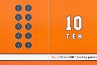 Far fewer changes are found in the other three reworked volumes. Most of the changes to Hockey 1 2 3 appears to be the insertion of "NHL" into the text. Consequently, for example, "Two hockey nets" are now "Two NHL nets", and "Four referees" are "Four NHL referees." The Atlanta Thrasher goalie, who was one of the seven goalies representing the number 7 Seven, has been replaced by a Buffalo Sabres goaltender (but not in the concluding "Let's Review" section). A more significant change was regrouping the 10 Ten official NHL hockey pucks into five pairs as opposed to the original four, four and two configuration.
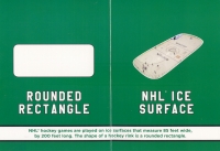 The text for Circle in Hockey Shapes has been modified to include the metric speed a puck can travel: "Some NHL players can shoot the puck at more than 100 miles (160 kilometres) per hour." Since this addition occurs in the text for the first shape in the book, readers might assume that all of the book's Imperial measurements will be followed by their bracketed metric equivalents. Such, is not the case, and the dimensions of an "official NHL" hockey net and rink are only given in feet. The perspective of the NHL Ice Surface photo has been altered so that it more closely resembles the Rounded Rectangle it is supposed to represent. Though the images of the four team jerseys containing stars have been increased in size, the "eye" star on the Minnesota Wild sweater is still too small to be easily found.
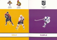
Changes to Hockey Colours were minimal and revolved around the team logo changes and the transfer of the Atlanta franchise to Winnipeg, an event which required a Thrasher player to be eliminated from the Gold page and caused the remaining images of a Florida Panther and Ottawa Senator players to be increased in size.
As noted earlier, Jordan has added two new books, Hockey Opposites and Hockey Animals, to the series. Hockey Opposites provides 14 pairs of opposites with 10 being presented via pairs of facing pages and four occurring within the illustration found on a single page. Again, one must remember that the word "Hockey" appears before the term "Opposites" in the book's title, and, as a consequence, the "definition" of each of these opposites is offered within the context of the sport.
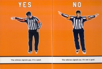 For instance, Yes/No is illustrated via two facing pictures of a referee. In one, he points with his arm, signalling that, "yes," a goal has been scored, and, in the other, he says, "no goal" by waving it off. Home/Away sees players from three different teams wearing their "home" dark-coloured sweaters and then dressed in their light-coloured "away" uniforms. On one page, "Jarome Iginla steps on the ice while, on the facing page, Sidney Crosby skates off the ice." For instance, Yes/No is illustrated via two facing pictures of a referee. In one, he points with his arm, signalling that, "yes," a goal has been scored, and, in the other, he says, "no goal" by waving it off. Home/Away sees players from three different teams wearing their "home" dark-coloured sweaters and then dressed in their light-coloured "away" uniforms. On one page, "Jarome Iginla steps on the ice while, on the facing page, Sidney Crosby skates off the ice."
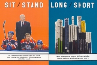 Sit/Stand sees three Edmonton Oiler players sitting on the bench while their coach, Tom Renney, stands behind them. Won/Lost is represented by a photo of the Boston Bruins' team captain raising the just won Stanley Cup over his head in 2011 while the inclined posture of Vancouver Canuck player is to signify "lost." Sit/Stand sees three Edmonton Oiler players sitting on the bench while their coach, Tom Renney, stands behind them. Won/Lost is represented by a photo of the Boston Bruins' team captain raising the just won Stanley Cup over his head in 2011 while the inclined posture of Vancouver Canuck player is to signify "lost."
Cold/Hot are explained via photos of a snow covered mountain and a sunny, sandy beach with the logos of the Calgary Flames and the Edmonton Oilers being overlaid on the snow and the Tampa Bay Lightning and Florida Panthers appearing atop the sand. Left/Right are explained in terms of where the forwards line up in relation to the centreman on face offs. An opposite like Fast/Slow really does not lend itself to being explained, however, by a static photo.
Certainly Hockey Opposites requires youngsters to bring some knowledge of the game of hockey to their reading of this board book. Like the earlier books in the series, Hockey Opposites concludes with a "Let's Review!" page, but some of the images in their reduced size are really too small to be useful.
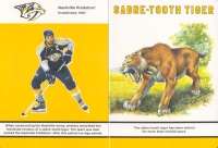 Of the 30 teams in the NHL, 10 have names or logos that incorporate an animal, and it is this connection between a team and an animal that is the focus of Jordan's Hockey Animals. Each of the teams, which are ordered alphabetically from the Anaheim Ducks to the Vancouver Canucks, is treated by a pair of facing pages. The left side page has a banner at the top which contains an image of the team's logo, the team's name and the year in which the team entered the NHL. A large photo of a player from the focus team takes up most of the rest of the page. Only two of the photos are of goaltenders, and, because the players are presented against a coloured background, to provide better contrast, most of the players are shown wearing their "away" uniforms. Another text banner, which is found at the bottom of the page, contains a brief explanation as to why the team came to be named after an animal or why it included an animal in its logo. For instance, in the case of the San Jose Sharks, when the team was established in 1991, "the city of San Jose held a 'name the team' contest. More than five thousand entries suggested the same name: the Sharks." When the Nashville arena was being constructed, "workers unearthed the fossilized remains of a sabre-toothed tiger. The team was later named the Nashville Predators after this extinct Ice Age animal."
The right-hand page has, with one exception, what appears to be a full-colour photo of the animal associated with the team. Since the sabre-toothed tiger is extinct, it is represented via an artist's rendering. The animal image is "sandwiched" between a top banner containing the animal's name and a bottom text banner that offers youngsters some brief information about the animal. About the Vancouver Canuck's stylized orca logo, for example, readers are told:
Also known as killer whales, orcas are huge mammals, with males growing as large as 22 feet (7 metres) in length and weighing as much as 12,000 pounds (5,500 kilograms). They hunt in packs.
Originally, in 1993, "[the] Walt Disney company named its team after the Disney movie of the same name - The Mighty Ducks. New team owners renamed the club the Ducks in 2006." Since the team's name is not specific as to which species of duck, Jordan has chosen to represent the team via the Mallard, explaining that "Mallard ducks are the most common of all ducks. You can spot a male by its bright blue or green head."
Throughout Hockey Animals, measurements are first given in Imperial units followed by their bracketed metric equivalents.
Although the series' format is that of the board book, the books' contents do demand a certain degree of hockey knowledge, and, therefore, the volumes will more likely appeal to the upper end of the suggested age range.
Recommended.
Dave Jenkinson, CM's editor, resides in the home of the beta version of the Winnipeg Jets.
To comment
on this title or this review, send mail to cm@umanitoba.ca.
Copyright © the Manitoba Library Association. Reproduction for personal
use is permitted only if this copyright notice is maintained. Any
other reproduction is prohibited without permission.
NEXT REVIEW |
TABLE OF CONTENTS FOR THIS ISSUE
- April 6, 2012.
AUTHORS |
TITLES |
MEDIA REVIEWS |
PROFILES |
BACK ISSUES |
SEARCH |
CMARCHIVE |
HOME |